How to Increase Conversion Rate Ecommerce: Proven Strategies

Discuss with AI
Get instant insights and ask questions about this topic with AI assistants.
💡 Pro tip: All options include context about this blog post. Feel free to modify the prompt to ask more specific questions!
Before we even talk about how to boost your e-commerce conversion rate, we need to get one thing straight: a "good" rate isn't a universal number. It’s tempting to chase that generic 2-4% benchmark you see everywhere, but that's often a distraction.
Your real goal is to optimize your own customer's journey. Think about everything from your site's speed and mobile experience to building trust with real customer reviews and making the checkout process dead simple. The secret is to consistently improve your own baseline with small, smart, data-driven tweaks.

Before you start changing buttons and rewriting copy, you have to set a realistic target. I've seen so many store owners get hung up on that average conversion rate of 2-4%, but that figure is almost useless without context. What’s considered a "good" rate for your store is tied directly to what you sell, who you sell to, and how you sell it.
Aiming for 4% when you sell high-end, custom furniture is just setting yourself up for frustration. On the flip side, if you’re selling low-cost, high-volume accessories, settling for 3% could mean you're leaving a lot of money on the table. The objective isn't just hitting an arbitrary number; it's understanding what that number actually means for your store's health and profitability.
Context is everything. A luxury watch brand converting at 1.2% might be wildly more profitable than a fast-fashion store hitting 3.5%. Why? The luxury brand’s high average order value (AOV) means every single conversion brings in substantial revenue, more than making up for the lower rate.
Think about all the variables that shape what a "good" conversion rate looks like for you:
- Product Type and Price Point: High-consideration items, like electronics or furniture, will always have longer sales cycles and lower conversion rates. They’re just a bigger decision than impulse buys like a t-shirt or a phone case.
- Traffic Source: A visitor who clicks through from a targeted email campaign is already warm. They’re far more likely to buy than a first-time visitor who stumbled upon your site from a broad social media ad.
- Audience Intent: Are people just browsing for ideas, or are they ready to pull out their credit card? Your marketing channels directly influence this mix.
- Brand Maturity: An established brand with a solid reputation and a loyal following will almost always convert better than a new shop that’s still trying to build trust.
Key Takeaway: Stop obsessing over a generic global average. The only number that matters is your own. Calculate your baseline conversion rate and make that your starting point. Your real competitor should be your performance last month.
Looking at global data, you’ll see that conversion rates are all over the map. For example, in 2025, the broader retail sector—including fashion and jewelry—is expected to average around 1.9%, and that's despite a notoriously high cart abandonment rate. Meanwhile, the electronics and home appliances category sees a much healthier average of 3.6%.
These numbers tell a clear story: success comes from using strategies tailored to your specific industry and audience. You can find out more about how conversion rates vary across industries and what that means for your store.
To get started, you need to know where you stand today. The formula is simple:
(Total Number of Sales / Total Number of Website Visitors) x 100 = Conversion Rate %
Track this number every month. This baseline becomes your north star. If you can move your rate from 1.5% to 1.8%, you've just achieved a 20% increase in sales from the exact same amount of traffic. That’s a massive win. Understanding this is the first real step to improving your conversion rate because it shifts your focus from chasing an abstract number to making real-world changes that grow your business.
Think of your website as the digital equivalent of a brick-and-mortar store. If the doors are hard to open, the aisles are cluttered, and the lighting is dim, customers will walk right out. The same principle applies online. Your website's performance is the bedrock of your entire e-commerce operation, and you only have a few seconds to make a great first impression.
Getting this foundation right goes beyond just making things "look nice." It's about a series of deliberate, measurable improvements that create a smooth and intuitive path from the moment a visitor arrives to the moment they click "buy." Let's walk through the technical fixes and user experience (UX) essentials that will stop you from losing sales before a customer even sees your products.
I can't stress this enough: every millisecond matters. In e-commerce, speed isn't just a nice-to-have feature; it’s a core requirement. Modern shoppers, especially those on their phones, have absolutely zero patience for slow-loading pages.
The financial stakes are high. The difference between an average store and a top-performer often comes down to performance. We've seen stores with a truly optimized foundation push their conversion rates to the 4% upper benchmark, a huge jump from the typical 2-4% average. The data backs this up. According to recent e-commerce conversion benchmarks, just a one-second delay in page load time can slice conversions by 0.3%.
Think about that. If your site takes an extra three seconds to load, you could be losing nearly 1% of your sales from that friction alone.
To get a clearer picture of where to focus your efforts, here’s a quick-win checklist of optimizations that tend to deliver the biggest bang for your buck.
This table isn't exhaustive, but it's a prioritized list of actions that consistently deliver the biggest boosts to e-commerce conversion rates. Start here.
Optimization Area Specific Action Potential Impact on Conversion Rate Page Speed Compress images, enable browser caching, and use a Content Delivery Network (CDN). High Mobile Experience Implement a responsive design with large, tappable buttons and simplified menus. High Navigation & Search Create logical categories and implement an intelligent site search with filters. High Checkout Process Offer guest checkout, auto-fill forms, and show a clear progress indicator. Very High Product Pages Use high-quality images/videos and write compelling, benefit-driven descriptions. Medium to High Trust Signals Display customer reviews, security badges, and clear return policies. Medium
By tackling the "High" and "Very High" impact items first, you're directly addressing the most common points of friction that cause shoppers to abandon their carts.
While it's true that desktop users often convert at a higher rate, the vast majority of your traffic is probably coming from a mobile device. A clunky mobile site isn't just an annoyance anymore—it's a guaranteed conversion killer. You can't just take your desktop site, shrink it down, and call it a day. You have to think mobile-first.
What does that actually mean in practice?
- Thumb-Friendly Design: All buttons and links need to be big enough to tap easily. Make sure there's enough space between them to prevent frustrating "fat finger" mistakes.
- Simple Navigation: Keep your menus clean and concise. The standard "hamburger" menu works well, but ensure the categories inside are logical and not overwhelming.
- Kill the Clutter: A mobile screen is tiny. Get rid of any non-essential pop-ups, banners, or walls of text. The focus should be squarely on the product and the path to purchase.
My Two Cents: Don't just rely on simulators. Test your site on actual phones—an iPhone, an Android, maybe an older model. This is the only way to feel the experience exactly as your customers do and uncover pain points you would have otherwise missed.
It sounds obvious, but if people can't find what they're looking for, they can't buy it. A confusing or disorganized navigation is one of the top reasons potential customers bounce and head straight to a competitor. Your job is to make finding products so intuitive, it feels second nature.
Start with a clean, simple main navigation menu. Limit your top-level categories to the most critical ones. From there, use clear subcategories to guide users deeper into your product catalog without making them think too hard.
But good discovery goes beyond just the menu. You need to build in tools that help people find what they need, fast.
- Smart Site Search: A great search bar with autocomplete suggestions and the ability to handle typos can be a game-changer for your e-commerce conversion rate.
- Powerful Filtering: Let people narrow down the options. Filters for price, size, color, brand, or other key attributes give them control and help them find their perfect product much faster.
- Helpful Breadcrumbs: These little navigational trails (e.g., Home > Women's > Dresses) show customers exactly where they are in your store and let them backtrack easily with a single click.
This simple graphic breaks down what an ideal checkout flow looks like—a critical part of your website's foundation.
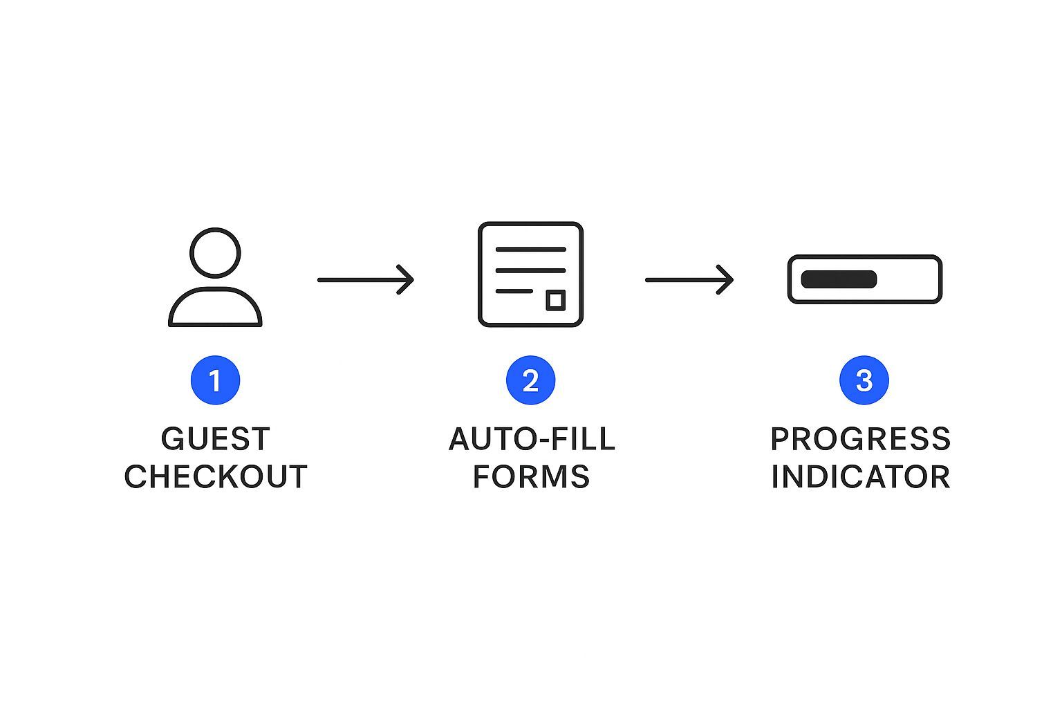
Every element here—from offering a guest checkout option to auto-filling forms and showing a progress bar—is specifically designed to remove friction and keep the customer moving smoothly toward completing their purchase.
Shoppers won’t buy from stores they don’t trust. It’s really that simple. Every single element on your site either builds a little more confidence or plants a seed of doubt. In e-commerce, doubt is the ultimate conversion killer.
Building that foundation of trust isn't about some magic bullet. It’s about creating a whole ecosystem of credibility that makes customers feel safe and confident, from the moment they land on your homepage to the final click at checkout. This means going way beyond a generic "About Us" page and weaving trust signals directly into the shopping experience itself.
When you get this right, these signals work together to dissolve that nagging purchase anxiety and turn hesitant visitors into loyal, repeat customers.
One of the most powerful assets you have is social proof. When potential buyers see that other people just like them have bought from you and had a great experience, their confidence goes through the roof. Suddenly, they aren't taking a risk on some unknown website; they're joining a community of happy customers.
But not all social proof is created equal. The real magic is in its authenticity and placement.
- Customer Reviews with Photos: Actively encourage your customers to upload photos with their reviews. A text review is good, but seeing a real person using and loving your product is infinitely more convincing.
- User-Generated Content (UGC): Get permission to feature customer photos from social media right on your product pages. This shows your products out in the wild, not just in a sterile studio setting, which is incredibly powerful for building trust.
- Specific Testimonials: Don't just settle for "Great backpack." Highlight reviews that tackle specific concerns or shout out key benefits. A review like, "This backpack's waterproof pocket saved my laptop in a downpour!" is far more impactful.
You need to place these trust-builders where they count the most—right on your product pages, near the "Add to Cart" button, and even during the checkout process to squash any last-minute hesitation.
Nothing kills a conversion faster than a surprise. Hidden shipping costs and convoluted return policies are notorious for creating instant distrust and are a top reason for abandoned carts. The best defense? Radical transparency.
Make your key policies impossible to miss. A shopper should never have to go on a scavenger hunt to figure out your shipping rates or return process.
A simple banner at the top of your site declaring "Free Shipping on Orders Over $50 & Easy 30-Day Returns" can work wonders. This upfront honesty removes major friction points before a customer even thinks about buying.
Alongside clear policies, you have to signal that your site is secure.
- Security Seals: Prominently display trust badges from providers like Norton, McAfee, or your SSL certificate. The footer and checkout page are prime real estate for these.
- Payment Logos: Show the logos of the payment methods you accept, like Visa, Mastercard, PayPal, and Apple Pay. It’s a subtle but important cue that you run a professional, legitimate business.
At the end of the day, people connect with other people, not faceless companies. Your brand story is your opportunity to forge a genuine human connection that transcends a simple transaction. A well-crafted "About Us" page can be a surprisingly effective conversion tool.
Don’t just list what you sell. Tell people why you sell it. What problem were you trying to solve? What core values drive your business day in and day out? Sharing your mission and the real people behind the brand makes you far more relatable and trustworthy.
This isn't just fluffy advice; the data backs it up. For instance, recent Shopify data revealed that while the average store converts at 1.4%, the top-performing stores are hitting 4.7% or more. These top-tier stores don't just move products; they build trust through every single interaction, from transparent policies to authentic storytelling. You can explore the full Shopify conversion rate report for more details.
Ultimately, every review, security badge, and clear policy is a block in your wall of trust. By also providing stellar support, you complete that circle of credibility. For a deeper dive, check out our guide on customer service best practices that help build relationships that last.
In a market flooded with options, a generic, one-size-fits-all approach just doesn't connect anymore. Shoppers have come to expect experiences that feel like they were built specifically for them. If you really want to move the needle on your conversion rate, you have to go far beyond just dropping a first name into an email subject line.
True personalization is all about crafting a genuine 1-to-1 shopping journey. It means taking all the customer data you have—what they tell you and what their behavior shows you—and using it to tailor every single interaction. The idea is to anticipate what a customer needs, sometimes even before they realize it themselves. When you get this right, your brand stops feeling like a faceless corporation and starts feeling more like a trusted, intuitive personal shopper.
The ultimate goal is to deliver relevance at scale. When you make every visitor feel seen and understood, you build a much deeper relationship that naturally guides them from just browsing to actually buying.
Effective personalization starts with digging deeper than broad categories like "new visitors" or "returning customers." While those labels have their place, today's tools let you tap into much more nuanced, behavior-driven insights that truly resonate with individuals.
Just think about the rich data you collect with every single site visit. You see their browsing history, what they add to their cart, past purchases, and even what time of day they prefer to shop. AI-powered platforms can crunch all these signals in real-time to create a unique, dynamic experience for every person.
Picture these scenarios in action:
- A visitor who was looking at hiking boots last week lands on your homepage and is immediately greeted with a banner showcasing new outdoor gear.
- Someone who just bought a new espresso machine from you now sees targeted ads for premium coffee beans and descaling solutions.
- A shopper from a colder climate is shown your latest winter coats, while a visitor from Florida sees lightweight jackets instead.
This isn't guesswork. It's about using data to make smart, automated decisions that make the shopping experience feel incredibly relevant. This kind of dynamic content adapts on the fly, ensuring that what a shopper sees is always perfectly aligned with their current interests and intent.
The old "Customers also bought" widgets were a decent start, but AI has taken product recommendations to a completely different level. Modern AI algorithms don't just look at what other people bought; they analyze an individual's unique clickstream behavior to predict what they are most likely to want next.
This opens up some incredibly effective upselling and cross-selling opportunities.
Key Insight: Information framing is a powerful psychological tool. When you present recommendations with a helpful narrative like "Complete Your Look" or "Frequently Bought Together," you're not just pushing products. You’re guiding the customer's decision-making in a way that feels natural and adds real value to their experience.
For instance, if a customer adds a dress to their cart, an AI-powered system can instantly suggest the perfect shoes and handbag to go with it, based on the purchasing patterns of other shoppers with similar style preferences. This kind of intelligent guidance is one of the most direct ways to boost both your conversion rate and Average Order Value (AOV).
Personalization doesn't stop when a visitor leaves your site. Behavior-triggered emails and text messages are essential for re-engaging customers at precisely the right moment. The trick is to make these communications feel timely and helpful, not creepy or intrusive.
Think about these powerful automated flows:
Trigger Type Communication Example Purpose Price Drop Alert "Good news! The running shoes you were looking at are now on sale." Re-engages a user who showed interest but was sensitive to price. Back-in-Stock "You're in luck! That sold-out item from your wishlist is available again." Recaptures a lost sale by notifying an interested shopper of availability. Post-Purchase Help "Here are three tips for getting the most out of your new camera." Builds loyalty and reduces returns by providing valuable follow-up content. Browse Abandonment "Still thinking about these items? Let us know if you have questions." A softer approach than a cart recovery email, this reminds a browser of products they viewed.
These automated messages work because they are directly tied to an action the customer just took, making them highly relevant and welcome. This kind of thoughtful, automated communication shows you're paying attention and helps nurture a browser into a loyal customer, which will have a huge impact on your e-commerce conversion rate over the long run.
The checkout process is where all your hard work pays off—or falls apart. After you’ve done everything right to get a shopper this far, the last thing you want is for them to leave because of a clunky, confusing, or surprising final step.
This is often the highest-leverage area for improvement. The average cart abandonment rate is a staggering 69%, and a difficult checkout is one of the biggest reasons why. By smoothing out the friction here, you can see a direct impact on your revenue without spending a single extra dollar on ads.
Putting a mandatory "Create Account" wall in front of a customer who is ready to buy is a classic conversion killer. Think about it from their perspective: they're a first-time buyer who just wants your product. They aren't ready to commit to a relationship with your brand yet.
Forcing them to sign up adds extra fields, requires them to create and remember a password, and feels like a needless barrier.
The fix is incredibly simple: always offer a prominent guest checkout option. It respects their time and gets them to the finish line faster. You can always ask them to create an account after the sale is done, right on the confirmation page. It feels like a friendly invitation instead of a demand.
Nobody likes a process with an unknown end. When a shopper has no idea how many pages or steps are left, they start to get antsy. Are they almost done? Is there another long form waiting around the corner? This uncertainty is a major cause of checkout abandonment.
A simple progress indicator solves this beautifully.
A visual bar or a clear set of steps (like Shipping > Payment > Review) tells customers exactly where they are and how close they are to being done. It's a small but powerful UI element that provides a sense of control and makes the whole process feel quicker and less intimidating.
Key Insight: Transparency is your best friend during checkout. Every step should feel predictable. When shoppers know what's next, they feel more confident and are far more likely to complete their purchase.
If there's one thing that will make a shopper slam the brakes, it's seeing unexpected costs pop up at the last second. They have a price in mind, and watching that total jump with high shipping fees or taxes feels like a bait-and-switch.
Be completely transparent about all costs from the very beginning.
- Add a shipping calculator: Let people check shipping costs right in the cart, before they even start checking out.
- Promote free shipping: Use a site-wide banner to clearly state your free shipping threshold (e.g., "Free Shipping on Orders Over $75!").
- Be upfront with taxes: If you can, show taxes and other fees early on to prevent sticker shock on the final review page.
Equally important is offering the payment methods your customers actually want to use. We live in an age of digital wallets, so limiting options to just credit cards is a mistake. Integrating one-click payment options like PayPal, Apple Pay, and Google Pay makes the transaction seamless, especially for the massive number of people shopping on their phones.
Some forward-thinking brands are even using payment innovation to recover abandoned carts by offering modern, ultra-convenient methods that resonate with younger, tech-savvy shoppers.
Look, even with the slickest checkout in the world, some people will still leave. Life happens. But that doesn't mean the sale is lost forever. A good recovery strategy is your last line of defense to bring these high-intent shoppers back.
When your site detects a user's cursor moving to close the tab, an exit-intent pop-up can be your final plea. But don't just flash a generic "10% Off!" offer. Make it relevant. If their cart total is $45 and free shipping kicks in at $50, your pop-up should scream, "Wait! You're only $5 away from free shipping!"
This is your bread and butter for cart recovery. An automated sequence of emails or text messages can claw back a huge percentage of otherwise lost revenue.
- The First Nudge: Send a simple reminder email or text about an hour after they leave. It’s often just a friendly, "Did you forget something?"
- The Follow-Up: A day or two later, you can create a little urgency. Maybe offer a small, time-sensitive discount or highlight rave reviews for the items in their cart.
Automating these follow-ups is non-negotiable for a busy store owner. For those looking to connect on the platforms their customers use most, exploring options like WhatsApp marketing automation can open up a direct and highly effective channel to re-engage shoppers and close the sale.
Diving into conversion rate optimization (CRO) can feel like opening a can of worms. You start with one question and suddenly have ten more. It’s completely normal. Let's walk through some of the most frequent questions I hear from fellow store owners to get you on the right track.
Honestly, it depends entirely on what you're changing. Some fixes give you a quick, satisfying win. For instance, if you run your product images through a compression tool and cut your load time by a full second, you could see a real bump in conversions in just a few weeks.
Bigger, more strategic projects are a different story. They require a bit more patience. If you're undertaking a complete website redesign, building up a solid base of customer reviews, or totally rethinking your brand's voice, you're looking at several months before you see a stable, meaningful impact. The trick is to make the change, keep a close eye on your analytics, and let the data tell you what's working.
If I had to put my money on one single strategy, it would be obsessing over your site's speed and mobile experience. A slow, clunky mobile site is the fastest way to lose a sale in today's world. It's just a fact. The vast majority of your traffic is probably tapping in from a smartphone, and those shoppers have zero tolerance for a poor experience.
Make sure your pages load in under three seconds and are dead simple to use on a small screen. By doing that, you're solving the biggest problem for most modern shoppers. This one focus almost always delivers the biggest lift and creates a strong foundation for everything else you do.
For almost any store that already has some traffic, you'll get a much better return on your investment by focusing on your conversion rate first. Think of your website as a bucket. If it's full of holes (a low conversion rate), spending money to pour more water (traffic) into it is a waste.
Patch the leaks first. When you improve your site, you make more money from the visitors you’re already getting. Once your store is a well-oiled conversion machine, every single dollar you spend on ads or SEO to bring in new people becomes exponentially more profitable. And of course, keeping the customers you worked so hard to get is just as important. Our guide on ecommerce customer retention has some great strategies for that.
There’s no one-size-fits-all answer here, as a CRO budget should really scale with your business. The best way to think about it isn't as a cost, but as a direct investment in your bottom line.
A good way to start is by carving out a small portion of your marketing budget—maybe 5-10%—for CRO tools, A/B testing software, or even getting some expert help. As you run tests and see them pay off, you can roll that newfound profit right back into more sophisticated optimization efforts. The goal is for CRO to become self-funding, paying for itself over and over again through more sales.
Ready to turn more visitors into customers with intelligent automation? Spur uses AI to engage shoppers 24/7 across every channel, answer questions instantly, and guide them smoothly from discovery to checkout. Start your free 7-day trial and see how Spur can boost your conversion rate.