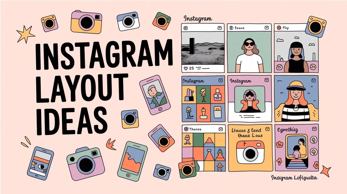
Instagram Layout Ideas: 9 Ways to Design Your Grid (2025)

Discuss with AI
Get instant insights and ask questions about this topic with AI assistants.
💡 Pro tip: All options include context about this blog post. Feel free to modify the prompt to ask more specific questions!
Your Instagram grid is your digital portfolio. In 2025, Instagram switched to a 4:5 aspect ratio for profile thumbnails, disrupting traditional square grids. This guide covers 9+ proven layout strategies (color palettes, checkerboards, puzzle grids, and more) to help you create a cohesive, scroll-stopping feed that converts visitors into followers.
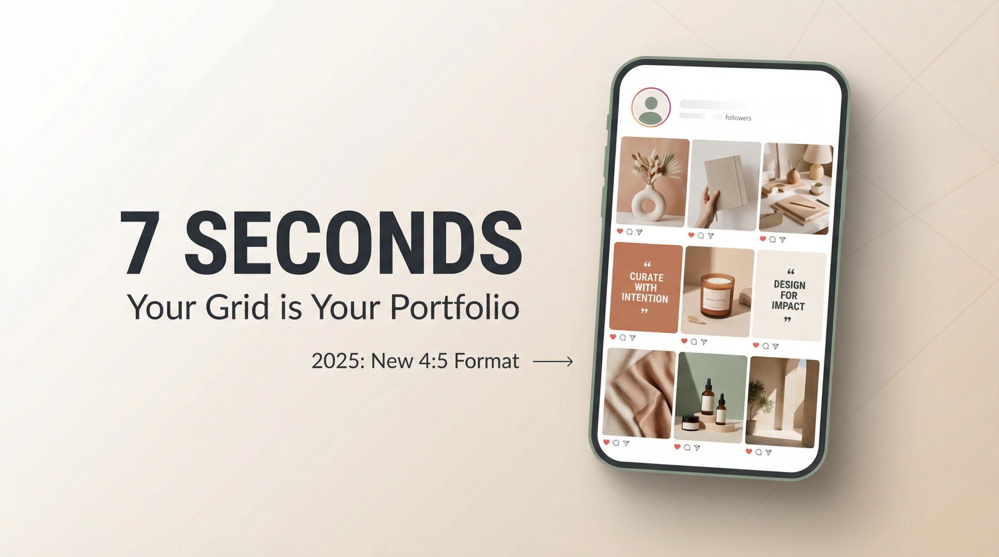
Your Instagram profile gets judged in less than 7 seconds. That's how long someone takes to decide whether your content is worth following.
Research shows people form instant opinions about social profiles based purely on visual presentation. Your grid isn't just a collection of posts. It's your brand story told at a glance.
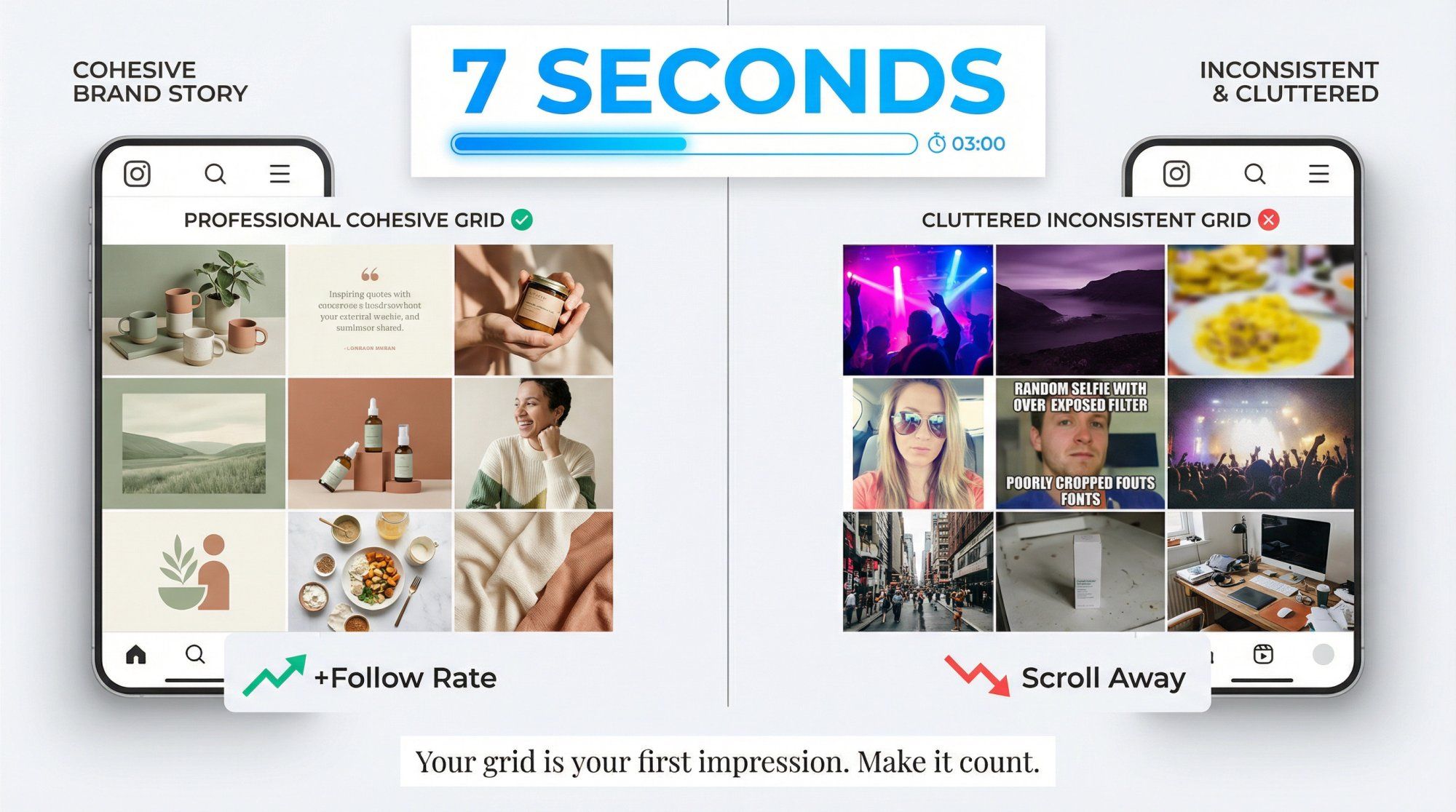
When someone lands on your profile, the top 6-9 posts act as your portfolio. A cohesive layout signals professionalism. It tells visitors you care about quality. Consistent colors, fonts, and themes help viewers instantly recognize your aesthetic, making your brand memorable in a crowded space.
On the flip side, a cluttered, inconsistent feed can turn off potential followers within seconds. Research confirms that an aesthetically pleasing grid directly impacts whether someone hits "Follow."
Think of it this way: your grid is like a book cover. If it looks appealing and tells a clear story, people will want to read more. The real magic happens when you combine stunning visuals with active community engagement strategies that turn profile visitors into loyal followers.
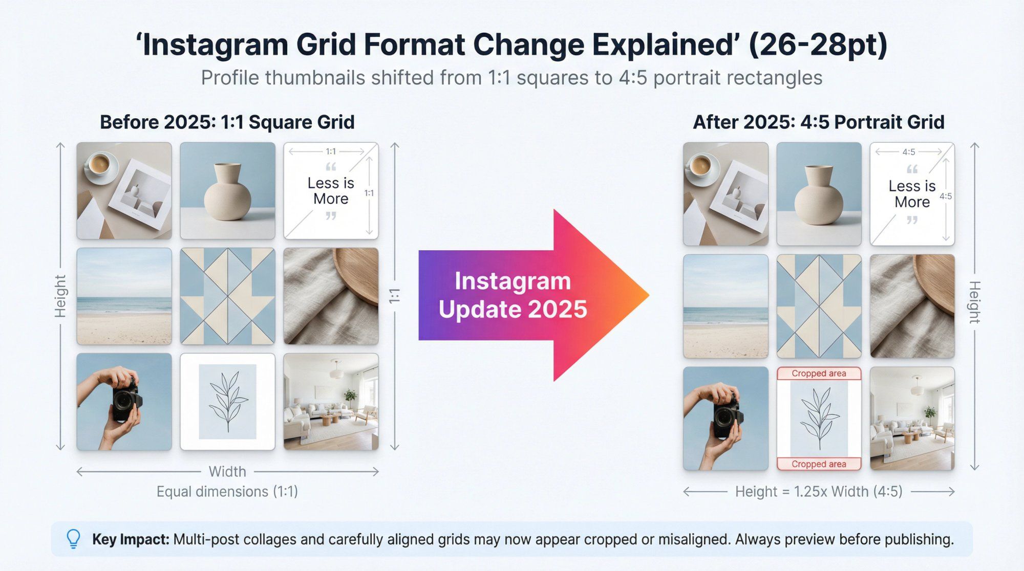
If your carefully planned grid suddenly looked different in early 2025, you weren't imagining things.
Instagram rolled out a major update: profile feeds now display thumbnails in a 4:5 aspect ratio instead of perfect squares. Following multiple previous test attempts, this change affected every account on the platform.
Portrait-oriented posts now appear taller in your grid, taking up more vertical space. Instagram made this shift to align with mobile-first consumption. Taller images fill phone screens better and stand out more when people scroll.
But there's a catch.
The new 4:5 aspect ratio has disrupted many carefully curated feeds that were built for the old 1:1 square look. Multi-post collages that once aligned perfectly? They might now appear cropped or misaligned.
The good news: Instagram introduced crop adjustment settings, and the 4:5 format creates both opportunities and challenges that smart creators are already leveraging. Whether you're a creator, influencer, or brand using Instagram automation to scale your presence, understanding these changes is crucial.
The key takeaway: Preview how new posts look in your grid before publishing to ensure important parts aren't cut off. All the classic layout strategies still work in 2025, but you might need to tweak your approach (adding borders, adjusting cropping) to make them shine.
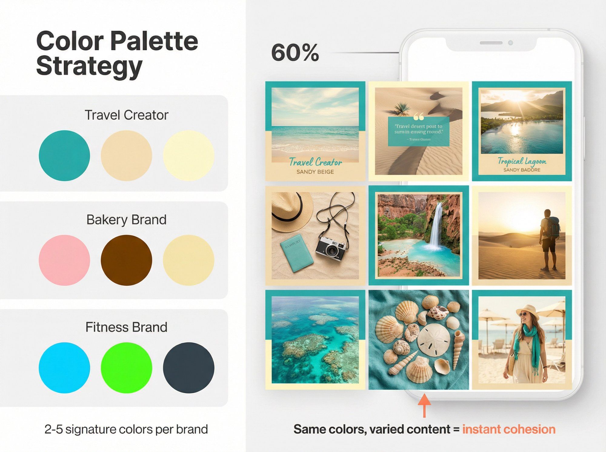
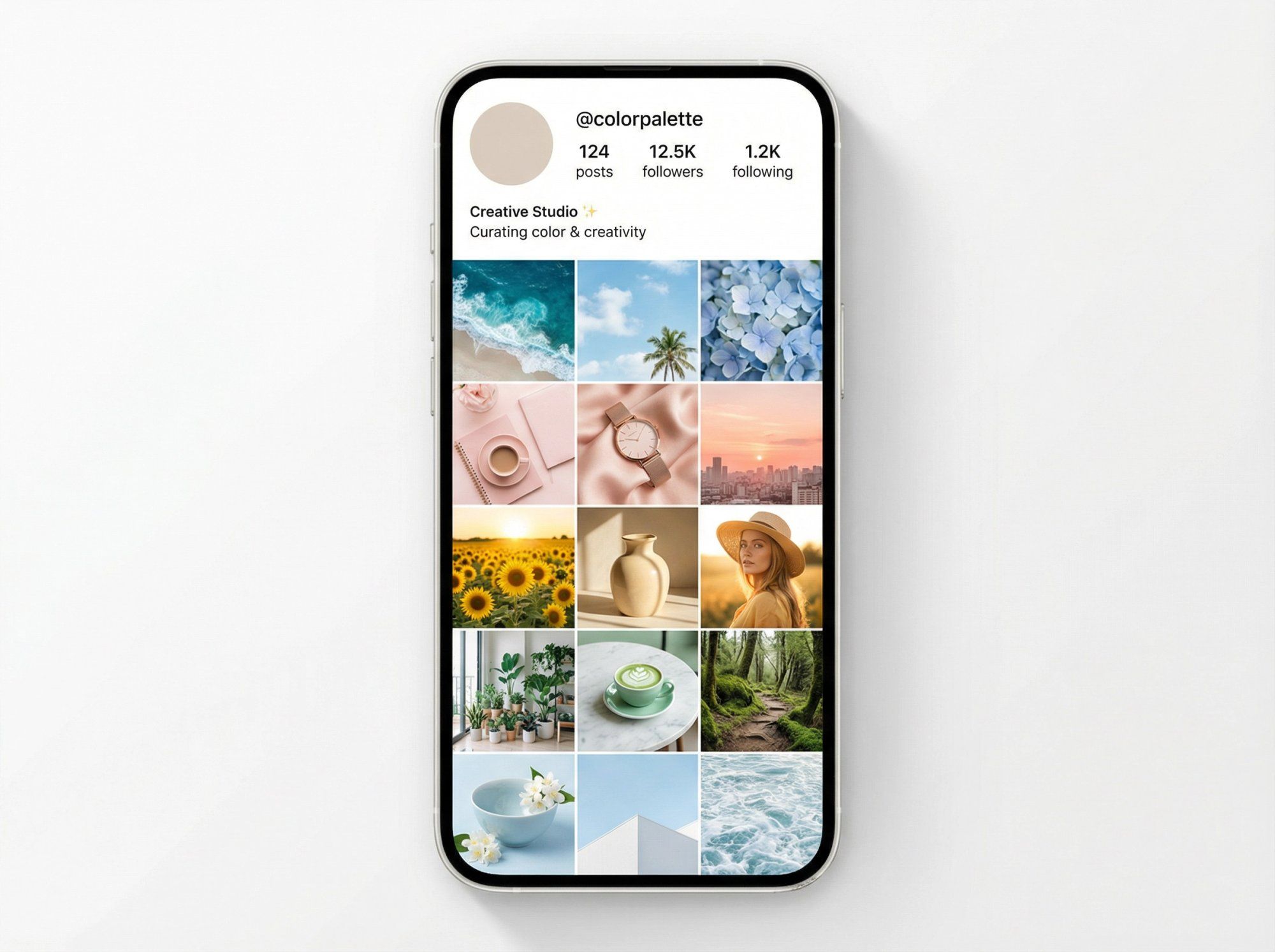
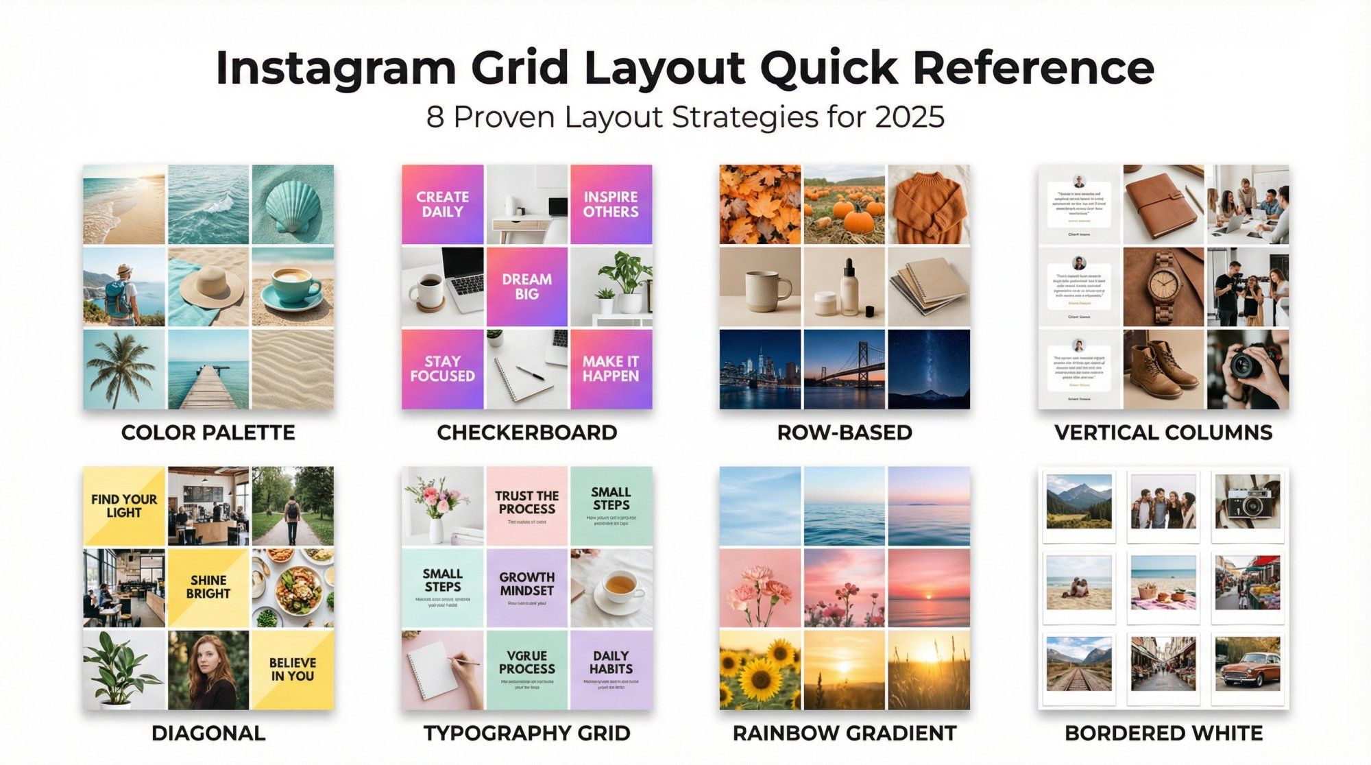
One of the simplest yet most powerful Instagram layout strategies is sticking to a consistent color palette across your entire feed.
Pick 2-5 signature colors and feature them in every post. The result? A visually unified grid that feels professional and curated, even when your subjects vary. This approach instantly creates a cohesive brand vibe that visitors recognize immediately.
Start by choosing colors that represent your brand identity. You might pull them from your logo, product packaging, or a specific mood you want to convey.
A travel creator might stick to teal and sandy beige for a beachy atmosphere. A bakery might use warm pinks and browns to reflect sweetness.
Looking at successful Instagram accounts, this color-coding approach could be one of the best Instagram layout ideas. Even when your content varies widely, maintaining signature colors creates visual unity.
Brand color consistency taken further: Major brands use their trademark colors in almost every post, making their content instantly recognizable even before you read the caption.
Humans are visual creatures. A harmonious color scheme signals that you're intentional about your brand. It also aids recognition. Followers can often identify your posts just by the color treatment, which builds familiarity and trust over time.
This visual consistency becomes especially powerful when combined with community building strategies that turn casual viewers into engaged followers.
Pro tip: You don't have to be too strict. You can add variety by rotating in an accent color occasionally. For example, mostly neutral tones with a pop of bright orange every fourth post creates visual interest without breaking cohesion.
Once you've established your visual brand through color consistency, social media automation tools can help maintain engagement with your growing audience.
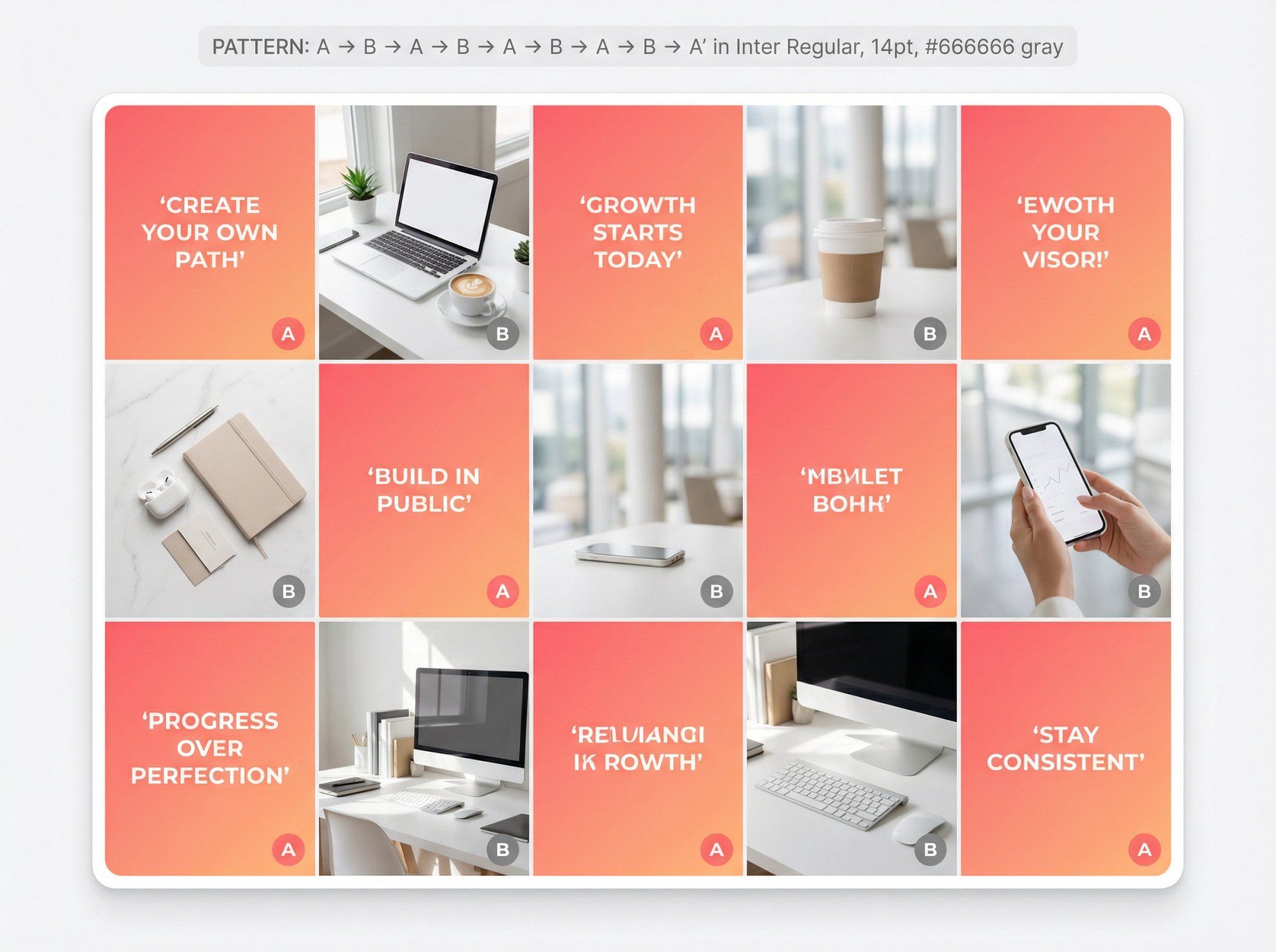
If a single-color theme feels limiting, try alternating two types of posts in a checkerboard pattern.
This layout alternates content in a repeating rhythm: post a quote graphic, then a photo, then repeat. From your profile view, visitors see a pleasing every-other-tile pattern that looks intentionally designed.
It introduces variety while maintaining organization. The alternating rhythm shows visitors you're thoughtful about content planning. Plus, it's visually striking without requiring complex design skills.
Real examples:
• Brands have created vibrant checkerboards by posting bold graphic tiles with gradient backgrounds between lifestyle photos
• Creators have alternated simple text posts with images to achieve a clean, professional look
Keep your two content types distinct enough for obvious contrast. Text on a solid background versus a full-bleed photo works well. You can also do a color-based checkerboard (alternating between two dominant background colors) instead of content types.
Planning is crucial. Use a content scheduler or preview app to ensure you don't accidentally break the sequence. Before posting, always check whether it should be "Type A" or "Type B" to maintain the alternating order.
For text-based posts in your checkerboard pattern, try using Instagram caption generators to create engaging, on-brand copy that complements your visuals.
Another striking approach is treating your grid one row at a time. Each row on your profile has three posts, so you design every set of three as a connected series.
Some creators make each row a panorama (three photos that form one wide image when viewed together). Others ensure all three posts in a row share a theme or color, creating distinct horizontal bands across the profile.
A fashion influencer might post three complementary outfits side by side, completing a "row" before moving to a new theme. Or a photographer could split a single landscape into three slices that align to show a continuous panorama.
Successful accounts have alternated images and quote graphics in sets of three, with each row using its own consistent background color. The result? A magazine-style striped effect as you scroll the profile.
For panoramas: Post three images at once (or in quick succession) so followers see the complete image in their feed and your profile row updates fully.
For thematic rows: You can post over time, but commit to the theme for three consecutive posts. Monday/Wednesday/Friday posts might all use the same color overlay or topic, completing the row by week's end.
Balance is key: Make sure each individual post still looks good on its own. Don't sacrifice single-post quality for the sake of the row. Balance both "grid view" and "feed view" appeal.
Note on the 4:5 format: If you're connecting a single image across a row, test the crop first. Leave padding in the original so nothing crucial gets chopped at the top or bottom when viewed on your profile.
For brands managing multiple Instagram and Facebook channels, consistent cross-platform formatting becomes even more crucial.
When planning content across multiple rows, marketing automation best practices can help you maintain consistency while scaling your content production.
Similar to row planning, you can design column by column. This means posts in each vertical column follow a specific pattern or theme.
You might dedicate the leftmost column to quotes, the middle to product photos, and the rightmost to behind-the-scenes content. When someone views your profile, they'll notice three distinct vertical streams running down your feed.
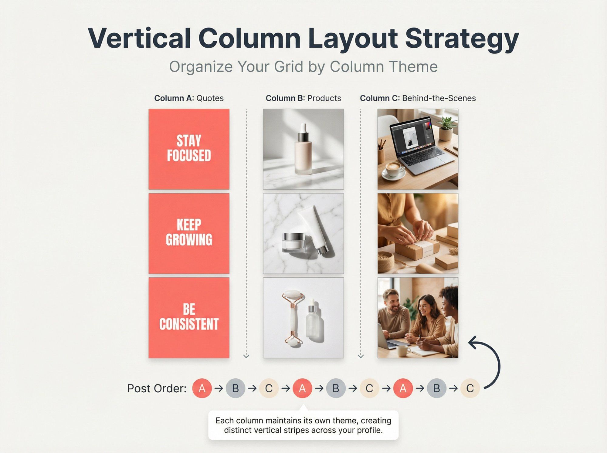
Successful feeds have been created where one column consistently featured white-background client spotlights while the other columns used tan backgrounds. The result is a striking vertical striped appearance.
① Identify 2-3 themes or formats you consistently produce
② Post in strict rotation (if your columns are A, B, C, always post in that order: A, then B, then C, repeat)
③ Preview scheduled posts to verify alignment
④ If you go off-order, the column pattern breaks
Benefits: Vertical layouts create a sleek, orderly appearance. They help ensure a good mix of content types. Your audience comes to expect, say, every third post is a quote, creating a predictable cadence they look forward to.
This structured approach works especially well for brands running Instagram DM automation campaigns, as consistent posting patterns help maintain audience engagement.
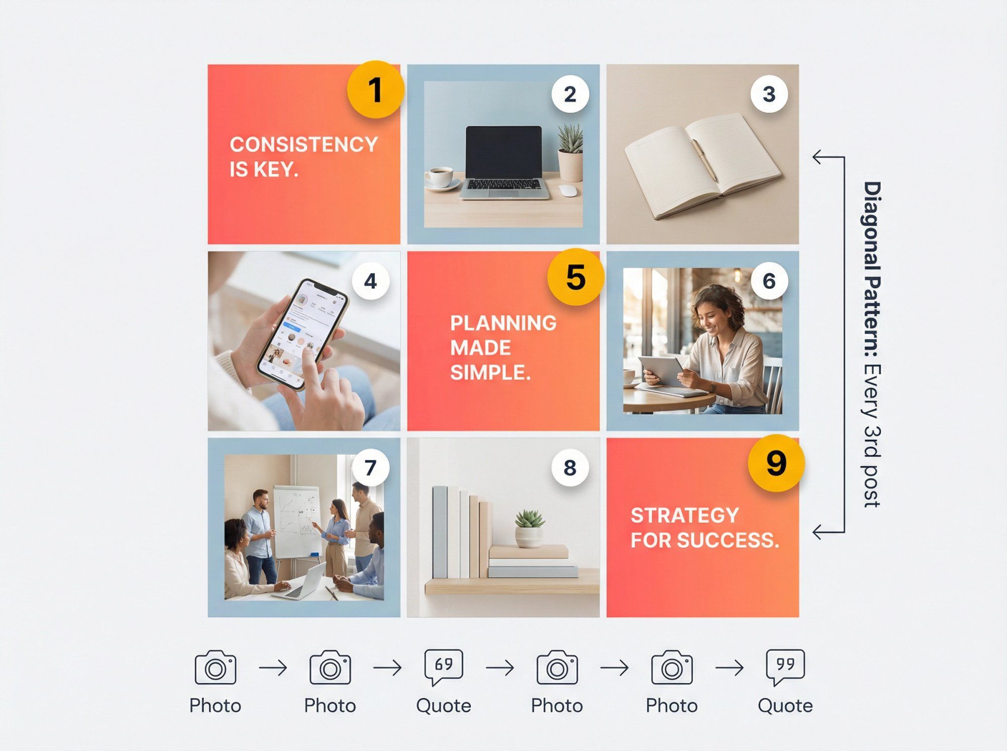
Feeling creative? Some accounts design feeds on a diagonal, where specific content types appear in positions that create diagonal lines across the grid.
For example, you might decide every fourth post is a bold quote on a colored background. In the grid, those quote posts naturally fall in a diagonal alignment. The effect is like a sash running across your profile.
Carefully count your posts and sequence content. A simple approach: post two photos, then one quote, then two photos, then one quote. This 2:1 pattern places quotes in a perfect diagonal. You can adjust the spacing (every third post a certain color) to create different angled patterns.
Why bother? While subtle, diagonal designs demonstrate high-level planning that impresses visitors. It's the kind of detail that makes someone pause and think, "Oh wow, I see what they did there!"
Warning: One off-beat post will break the chain. The diagonal effect disappears if you don't maintain strict sequencing.
For creators who want to maintain such intricate patterns without manual oversight, social media lead generation automation can help ensure posting consistency.
Not every post needs to be a photo. Many successful accounts mix text-based posts (quotes, announcements, tips) into their grids. When done with consistent style, typography-driven posts give your feed a chic, editorial look.
Think of your profile like a magazine page: a mix of striking images and compelling headlines creates engagement.
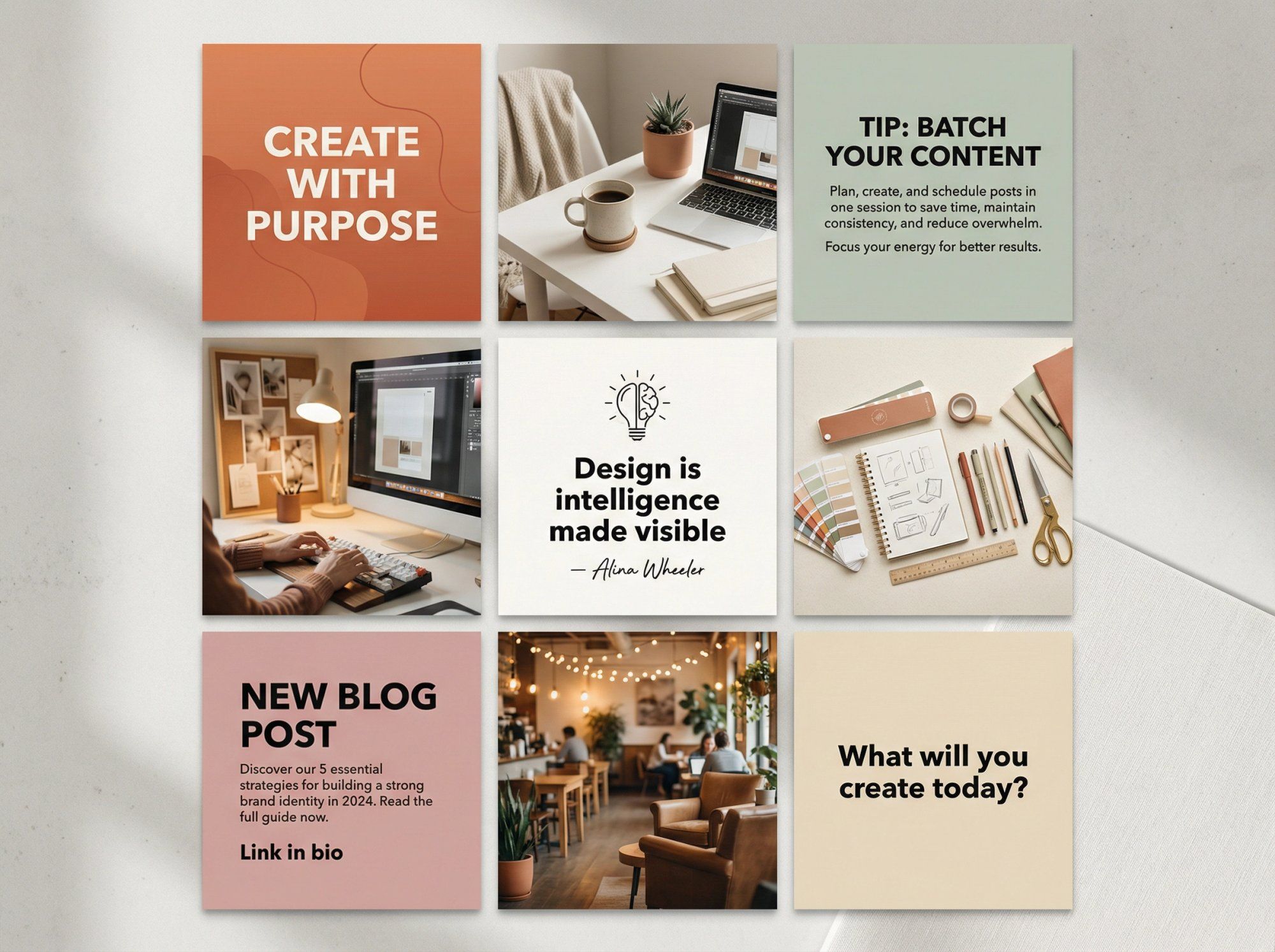
Use a limited set of fonts and graphic styles that match your brand. You might always use the same bold sans-serif for big quotes and a cursive for attribution, with the same background color or template for each text post.
Brand examples:
• Some accounts frequently intermix inspirational quotes, always using the same fonts and design aesthetic so quotes are instantly recognizable
• Others use clean sans-serif text on bright backgrounds to share productivity tips
They break up visual monotony and often boost engagement (people love saving and sharing quote graphics). They also let you communicate messages directly, whether it's a motivational quote, a question to your audience, or an informational tip.
Planning tip: Decide where text posts fall in your layout. Some accounts do a checkerboard with text versus photos. Others do two photos then a text post, repeating (which creates a diagonal pattern). Always preview to ensure text is readable in thumbnail view and doesn't get cut off by the 4:5 crop.
Engaging text posts combined with auto reply Instagram DM capabilities help you maintain conversations even when you can't respond manually to every comment.
Want to really wow visitors? Consider a rainbow feed that gradually transitions through colors like a spectrum.
As someone scrolls your profile, they see your posts shift from one hue to another in a smooth flow. Your first few rows might feature blue tones, then move into greens, then yellows, eventually covering a rainbow of colors.
The overall effect is visually striking and showcases serious dedication.
Lifestyle photographers have created feeds that flow through pastel pinks to blues to greens, making their profiles look like curated color journeys.
Another approach: brands go through phases where they focus on one color (soft aqua tones), then gradually transition to another like light yellow. Scrolling their profiles reveals a beautiful ombré effect.
| Step | Action |
|---|---|
| Plan sequence | Choose 3-4+ colors (blue → pink → white → black) or full spectrum |
| Allocate posts | Decide posts/rows per color (one row per color, or nine posts per color block) |
| Source content | Be selective with subjects (during "green phase," feature plants, landscapes, green overlays) |
| Smooth transitions | Use transitional posts (going blue to green? Insert a teal/turquoise post between) |
Reality check: This layout is advanced. It might take months to cycle through your planned gradient. It can restrict what you post at any given time (you might hold back a great photo if it doesn't fit the current hue).
But if done right, it's undeniably impressive and the kind of feed people screenshot and share.
For influencers and brands maintaining such intricate feeds, influencer marketing tools can help track performance across different color phases and identify what resonates most with your audience.
One often overlooked trick for a clean feed is adding consistent borders or frames to your posts.
By placing a border (often white, but could be any color) around each image, you create visual separation and regular grid spacing. Borders make your layout look more organized and distinct, almost like a gallery wall with matching mats.
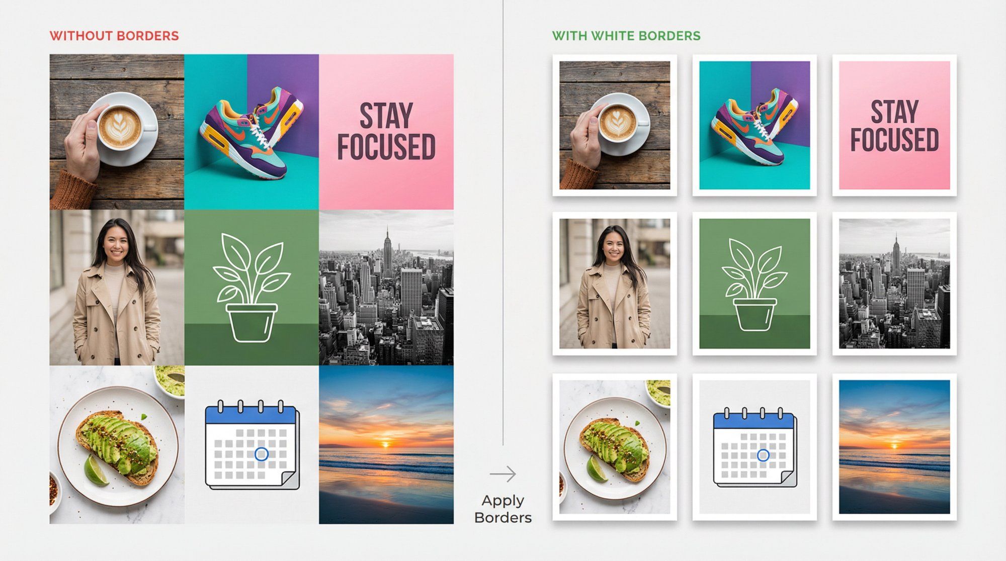
With Instagram's new aspect ratio changes, some photos don't crop well in the grid. A border can ensure the whole image fits within your preferred ratio by padding it out.
You can take a 4:5 portrait and add white space around it so that on your profile it appears as a neat square (no unexpected cropping of important elements).
Stylistically, borders reinforce your brand. Using a signature color as a frame carries your theme. Using a Polaroid-style frame with caption space gives a retro scrapbook vibe.
Creators are known for white borders, giving their feeds a vintage, clean aesthetic. The blank space draws attention to the photos and makes the grid less visually crowded.
You don't need fancy tools. Many editing apps (Instagram, Canva) let you position your image on a colored background. Third-party apps are designed specifically to add consistent frames.
Keep it consistent: same border style every time for cohesion.
One caution: If you use a non-white border, be mindful of how it appears in Instagram dark mode. White or light gray borders are safe choices that work in all viewing modes.
When you're ready to share your bordered posts, features like Instagram chat link generators make it easy for followers to reach you directly.
Want to create maximum impact? Try a puzzle grid where individual posts connect to form a larger image or mosaic when viewed together.
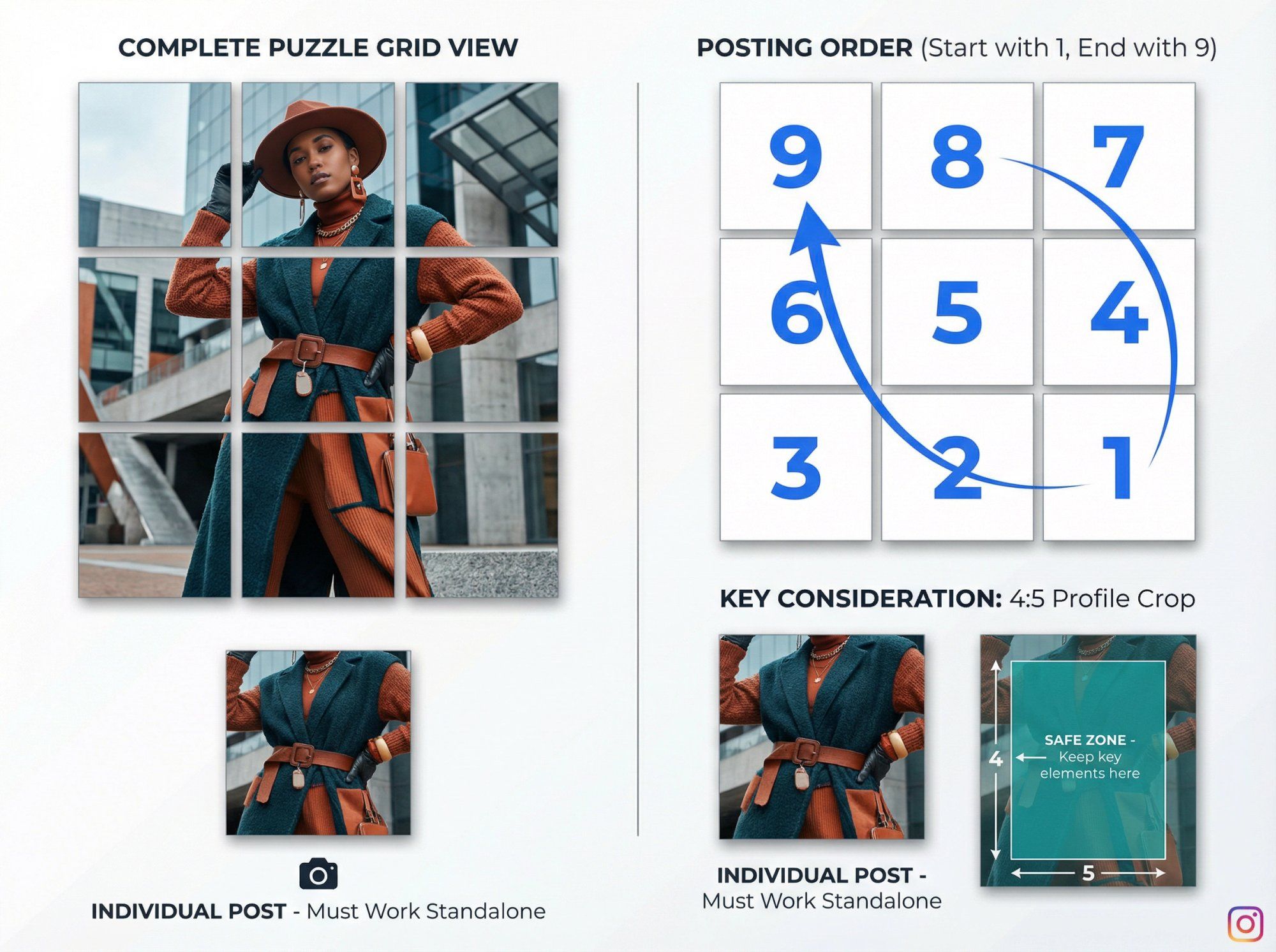
This can range from a 3-post series (one image split into three) to a 3x3 nine-post grid making one giant picture. Some brands extend puzzles beyond 3x3, creating a scrollable mural on their profile.
When executed well, puzzle grids look like pieces of art.
A fashion brand might take a single model photo and slice it into six squares, posting them so the profile shows the full outfit. A graphic designer might design a collage spanning 9 posts for a campaign announcement.
Brands often connect images across one or two rows at a time, so each row is a continuous image, yet each post still works individually. This creates periodic dramatic wide-image effects without every post being part of a giant puzzle.
Plan the entire image first. You'll need photo editing software (Photoshop, Canva, or specialized "grid maker" apps) to slice the image into squares. For a 3x3, design your canvas as one big square composed of smaller squares.
Ensure each segment can stand alone. This is crucial. Users' feeds show one piece at a time. If that piece is just a random sliver with no context (a bit of sky or piece of a letter), it might look odd. Try to include a subject or mini-composition in each slice, or overlay text so each tile has meaning by itself.
Mind the posting order. You have to publish in reverse order because Instagram arranges posts left-to-right, top-to-bottom based on posting time. For a 3x3 image, the last piece you post appears in the top left of your grid. Many puzzle-planning apps guide you on the posting sequence.
Account for 4:5 cropping. Instagram now shows the center of each image in the grid. If your puzzle pieces touch the edges of the original square, parts might be missing on profile view.
Design your puzzle with margin in each square (like a built-in border) so key parts are centered and align well in 4:5 view.
Understanding what is Instagram Direct can also help you leverage private messaging to share behind-the-scenes puzzle creation content with your most engaged followers.
Puzzle grids are fantastic for special events: product launches, big announcements, creative showcases. They generate buzz (people might follow to see the picture complete if you stagger posts) and are highly shareable.
Because they're labor-intensive, many accounts use them sparingly. Perhaps a big 9-post puzzle once per quarter, with simpler layouts the rest of the time. This keeps the element of surprise and avoids overwhelming your content pipeline.
For brands running major campaigns with puzzle grids, combining them with Instagram automated behavior tools ensures you can still respond to the influx of engagement these eye-catching posts generate.
Choosing a layout idea is just the start. The real challenge is consistently executing it.
Here's how to stay on track:
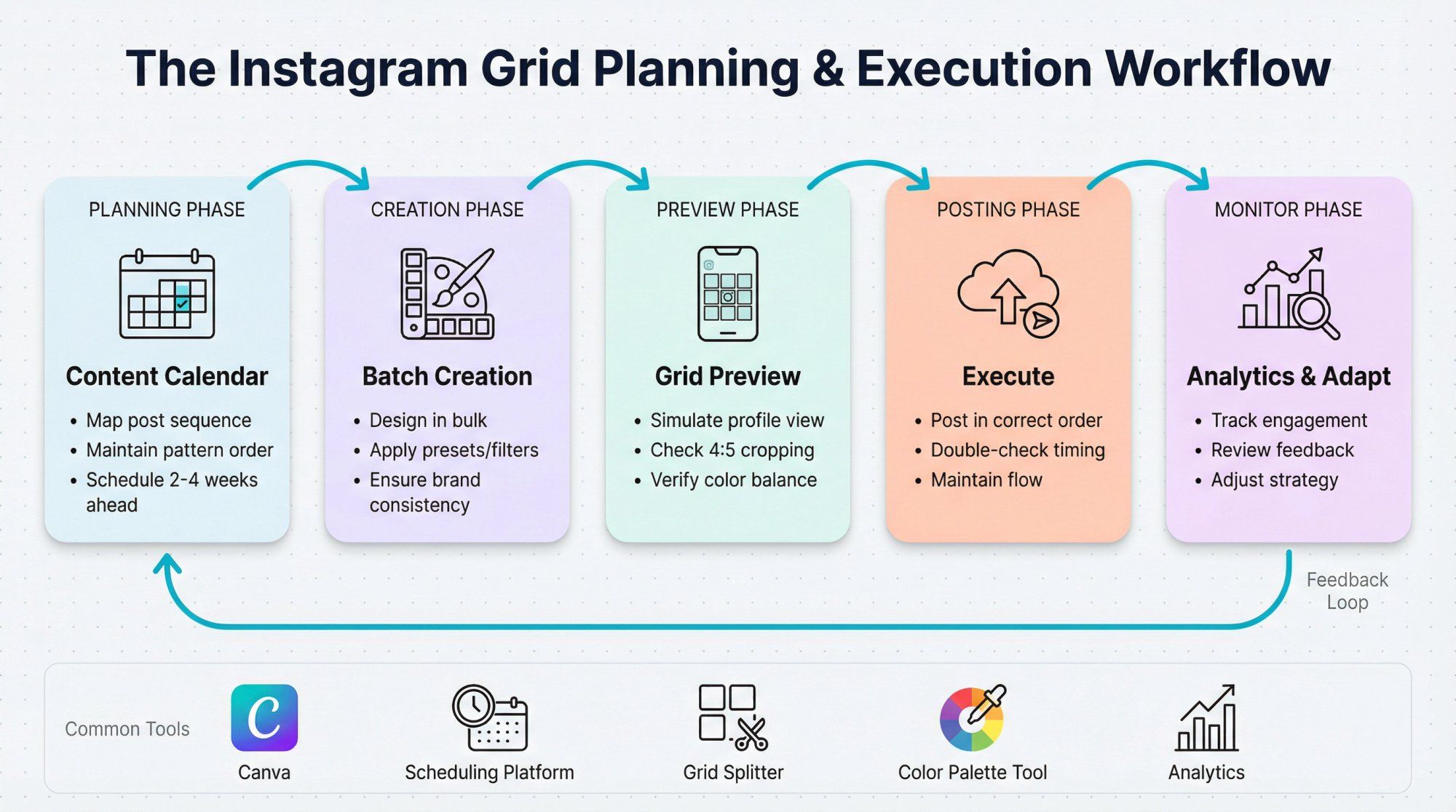
With the new grid format, it's critical to check how a post appears on your profile before publishing.
Use tools that simulate your Instagram grid. Apps and scheduling platforms offer grid preview features. Previewing ensures you catch layout disruptions and that colors/photos are balanced before going live.
Measure twice, post once.
Maintaining patterns (alternating content, color themes, posting in sets of three) requires planning. A social media content calendar maps out your sequence, reducing the chance of an off-brand post breaking your flow.
When you're managing high volumes of engagement from your well-planned grid, knowing how to search messages in Instagram becomes essential for staying organized.
To stay consistent, design elements in bulk. If you use quote graphics frequently, make a batch with your chosen font and style so they're ready to integrate into your feed. Edit groups of photos with the same preset or filter to ensure a unified tone.
While a pretty grid is valuable, engagement and content quality come first. Keep an eye on your analytics using social media engagement measurement strategies.
Are you sacrificing timeliness or relevance to maintain a pattern?
Ideally, your layout strategy should complement your content strategy, not hinder it. It's okay to break the pattern for a really important post. You can always resume your layout afterwards.
Also, pay attention to audience feedback. If they love the new layout, continue. If they seem indifferent, evolve your approach.
Some brands switch layout ideas seasonally. You might do a darker-toned grid in winter, then a bright, colorful grid in summer. As long as each phase is internally consistent, your profile still looks cohesive overall (think of it like chapters in a book).
Planning transitions (using a row of posts to gradually introduce the new style) makes your profile dynamic and interesting over time.
For brands using Instagram Conversion API for lead generation, seasonal layout changes can be tracked against conversion metrics to identify which aesthetics drive the best results.
Beyond preview apps, many resources simplify your design work:
• Canva has loads of Instagram grid templates and lets you design puzzle slices easily
• Split photo tools will cut images into grids automatically
• Color palette generators help you gather content in each hue for rainbow feeds
By combining a solid layout idea with smart planning tools, you'll create a feed that looks fantastic and is sustainable to manage long-term.
A stunning Instagram layout attracts visitors. But genuine engagement converts them into loyal followers.
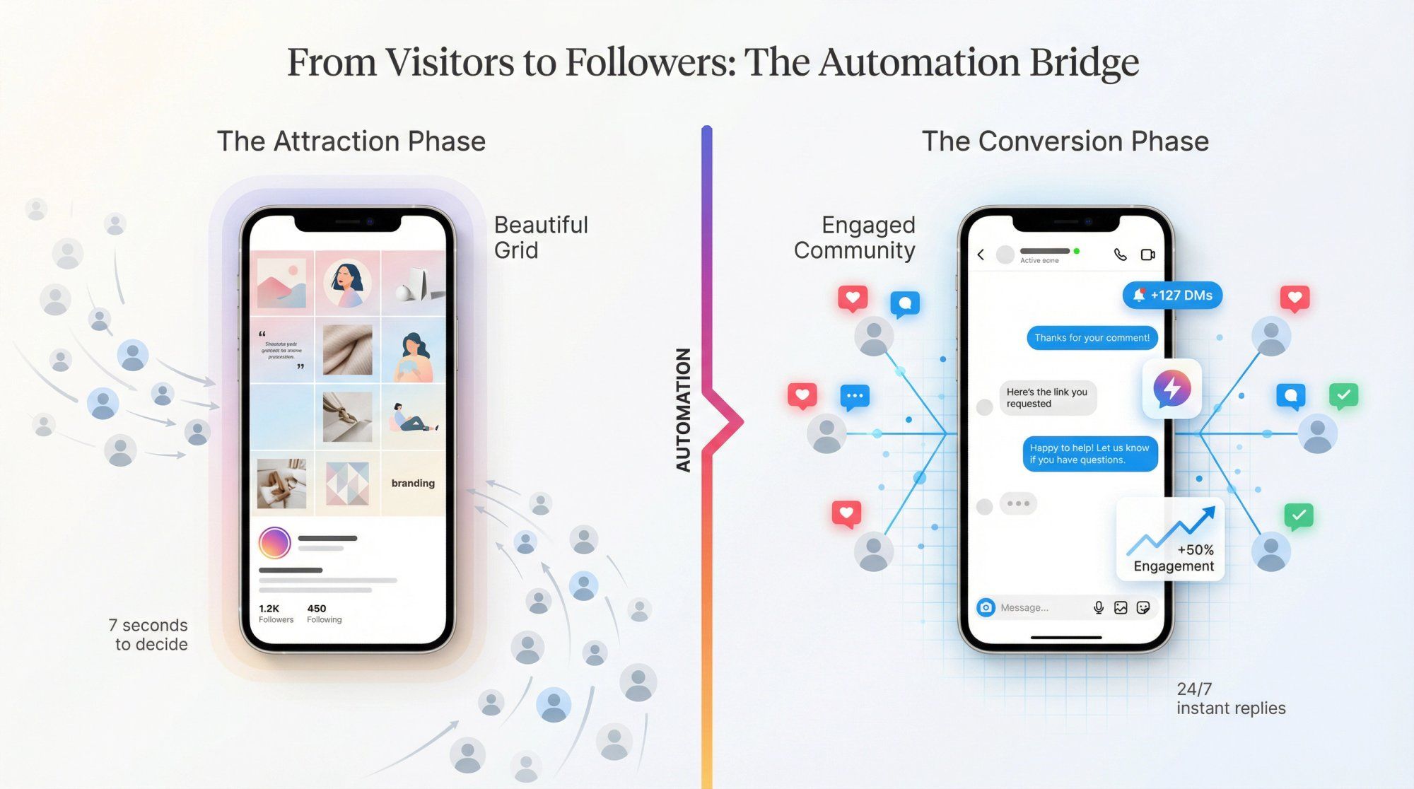
As you implement these layout strategies, don't forget to actively interact with your audience. Respond to comments, engage with other profiles, and use Stories and Reels to add depth beyond your curated grid.
A beautiful feed might bring people to your profile, but if you're slow to respond to DMs or comments, they'll bounce. Manual engagement doesn't scale when you're getting dozens (or hundreds) of interactions daily.
This is where automation becomes essential.
Spur's Instagram Automation helps you maintain high engagement even when you're busy. It can auto-reply to Instagram comments with preset responses, instantly sending product links, thank-you messages, or conversation starters to people engaging with your posts.
Unlike basic chatbots, Spur's actionable AI agents are trained on your own knowledge base (your website content, product information, FAQs). This means responses are genuinely helpful and on-brand, not generic auto-replies that feel robotic.
Plus, Spur is an official Instagram partner, using the Instagram API reliably and in compliance with platform guidelines. You can automate story reactions, mention replies, and comment-to-DM flows that move engaged users into private conversations where real relationship-building happens.
The result? Your beautiful grid brings people in. Your automated yet personalized engagement keeps them around.
Whether you're running click-to-Instagram direct ads or building organic growth, Spur helps you scale engagement without sacrificing the personal touch that makes followers become customers.
An Instagram grid layout is the visual arrangement of your profile's posts when viewed as a whole. It's the 3-column grid of thumbnails that appears on your profile page. A well-planned layout creates a cohesive, branded appearance that tells your story at a glance.
In 2025, Instagram changed profile thumbnails from perfect squares (1:1) to vertical rectangles (4:5 aspect ratio). This means portrait-oriented posts appear taller in your grid. Carefully curated feeds built for square grids may now appear cropped or misaligned, requiring creators to adjust their strategies.
Start with a cohesive color palette. Pick 2-5 signature colors and use them consistently across all posts. This creates instant visual unity without requiring complex planning or design skills. Apply these colors through backgrounds, filters, props, or editing presets.
Absolutely. Many successful accounts combine strategies. You might use a color palette as your foundation, add a checkerboard pattern for variety, and occasionally create a puzzle grid for special announcements. The key is maintaining consistency within whatever combination you choose.
Use planning apps or scheduling platforms that offer grid preview features. These tools let you upload and arrange future posts in a grid simulation before publishing, showing how new posts will look alongside your existing content.
Yes. Adding consistent borders to your posts can ensure important elements aren't cropped in the grid view. Borders create padding that keeps your full image visible and add visual separation between posts, making your grid look more organized and gallery-like.
This depends on your chosen strategy. Row-based layouts work best when you post in sets of three. Checkerboard patterns require strict alternation (which you can achieve with any posting frequency as long as you maintain the order). Color palette and border strategies are flexible and work with any posting schedule.
For optimal engagement rates regardless of your posting frequency, explore automated lead generation strategies that work alongside your content calendar.
No. While a cohesive grid is valuable, engagement and content quality should come first. If you have a timely, relevant post that breaks your pattern, post it anyway. You can always resume your layout afterwards. The best strategy complements your content, it doesn't restrict it.
Stories and Reels don't appear in your grid, so they won't affect your layout. Use them to add personality, show behind-the-scenes content, and engage with your audience in ways that complement your curated grid without disrupting its visual cohesion.
If you're getting overwhelmed managing Instagram comments across your grid posts, Stories, and Reels, automation can help maintain consistent engagement across all formats.
Understanding what is reposting on Instagram can also help you amplify your best grid content to Stories and Reels.
Yes. Many accounts evolve their layouts seasonally or as their brand develops. If you want to change strategies, consider using a row of transitional posts to gradually introduce the new style. This makes the shift feel intentional rather than abrupt.
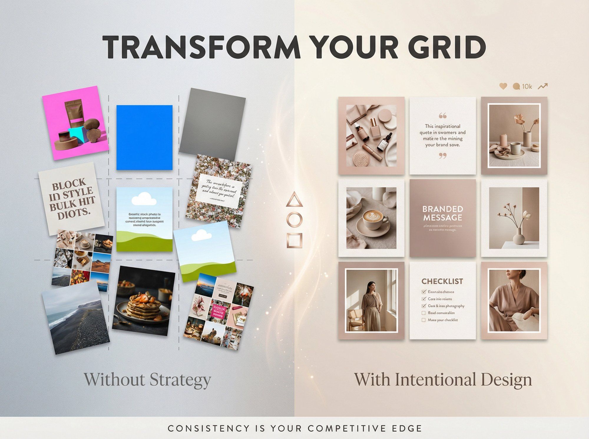
Your Instagram grid is more than a collection of posts. It's your visual identity, your brand story, and often your first impression.
In 2025, with Instagram's new 4:5 aspect ratio, planning your layout matters more than ever to ensure your aesthetic isn't thrown off by unexpected cropping.
The nine layout strategies we've covered (color palettes, checkerboards, row planning, vertical columns, diagonals, typography integration, rainbow feeds, borders, and puzzle grids) all work in the new format. You just need to preview, plan, and adapt them to the taller thumbnail display.
Remember these principles:
Start with a strategy that fits your brand personality and content style. Don't be afraid to experiment and mix techniques. A checkerboard combined with a seasonal color progression can be incredibly effective.
Preview before you post. Use planning tools to catch layout disruptions before they go live.
Balance aesthetics with authenticity. Your grid should look intentional, but never at the expense of timely, valuable content.
Engage beyond the grid. A beautiful layout attracts visitors. Genuine interaction (supported by smart automation like Spur) converts them into loyal community members.
Your feed is a living canvas that evolves with your brand. Whether you choose a subtle color palette or an ambitious rainbow gradient, the key is consistency within your chosen approach.
Execute it well, and you'll create a profile that doesn't just stop thumbs mid-scroll but earns that precious "Follow" tap.
Ready to take your Instagram presence to the next level? Combine your stunning visual strategy with Instagram automation tools that help you engage at scale.
When your beautiful grid works alongside intelligent automation, you create an Instagram presence that both attracts and retains followers.
For brands looking to convert Instagram engagement into revenue, explore how e-commerce marketing automation can turn your Instagram grid into a powerful sales channel.
And if you're managing Shopify inventory alongside your Instagram presence, learn how to connect Shopify to Instagram for seamless product tagging.
Start planning your feed transformation today, and watch as your Instagram presence becomes the scroll-stopper you've always envisioned.
For additional support with managing DM volumes from your stunning grid, explore solutions for when Instagram DMs are not working.